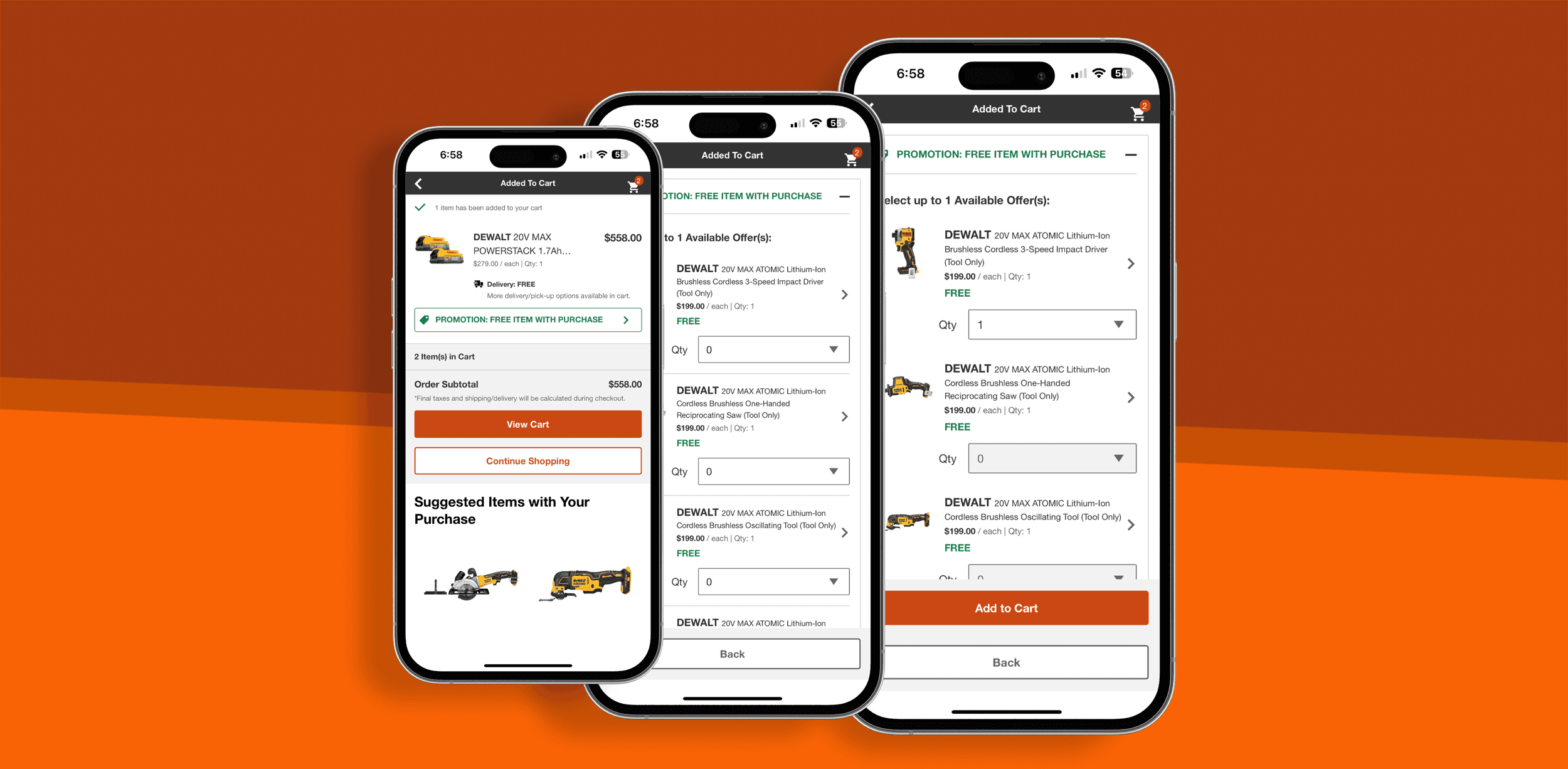
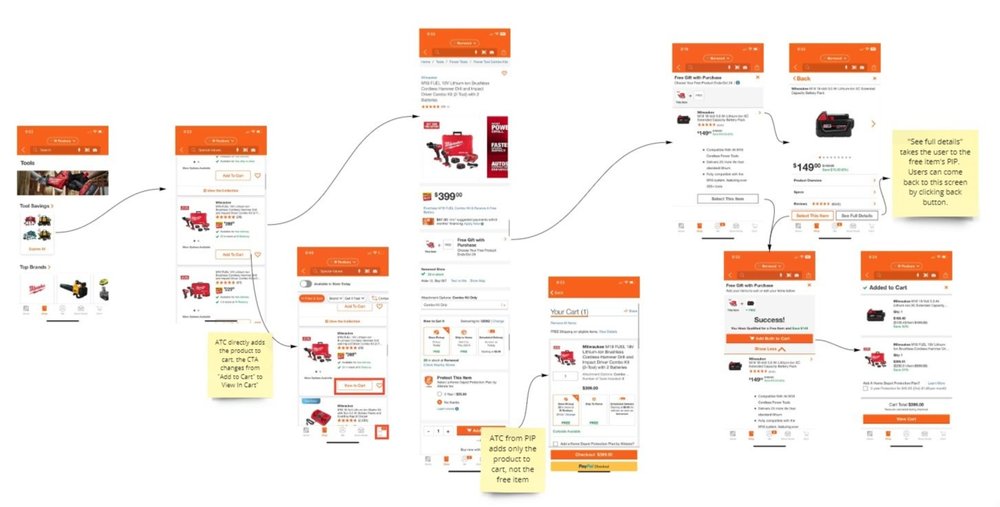
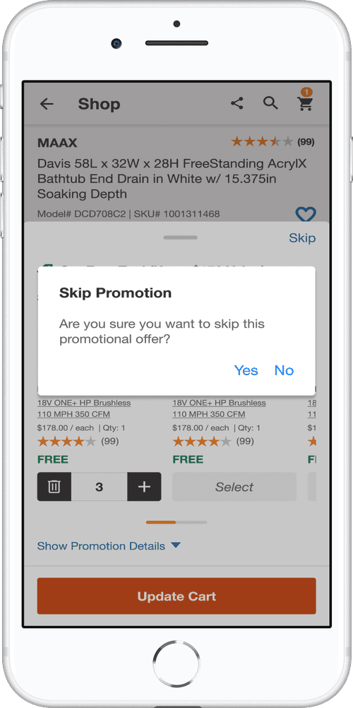
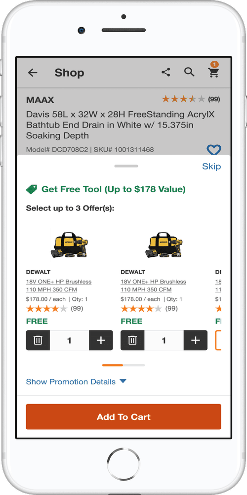
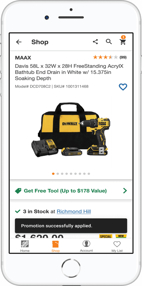
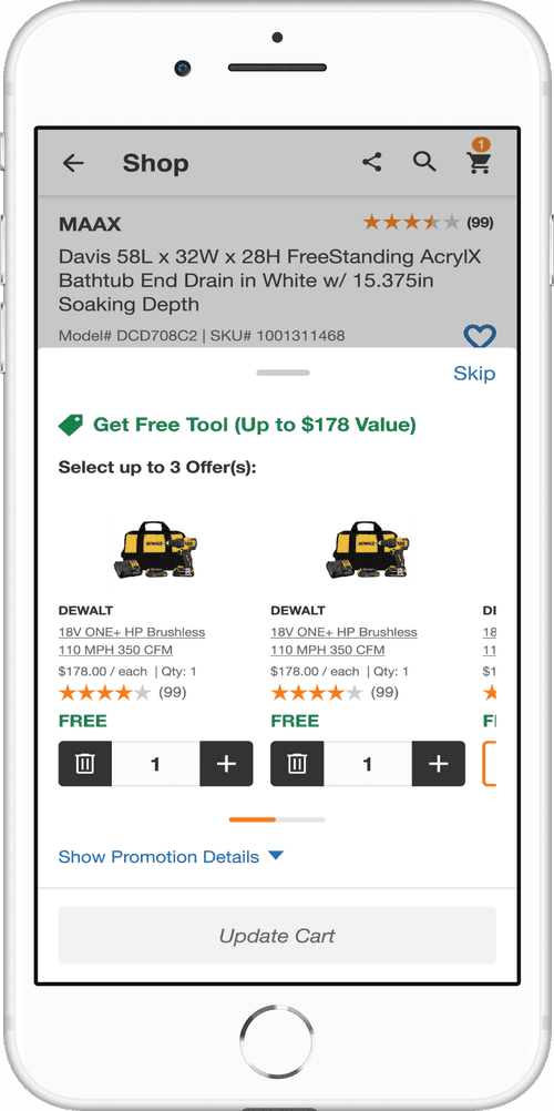
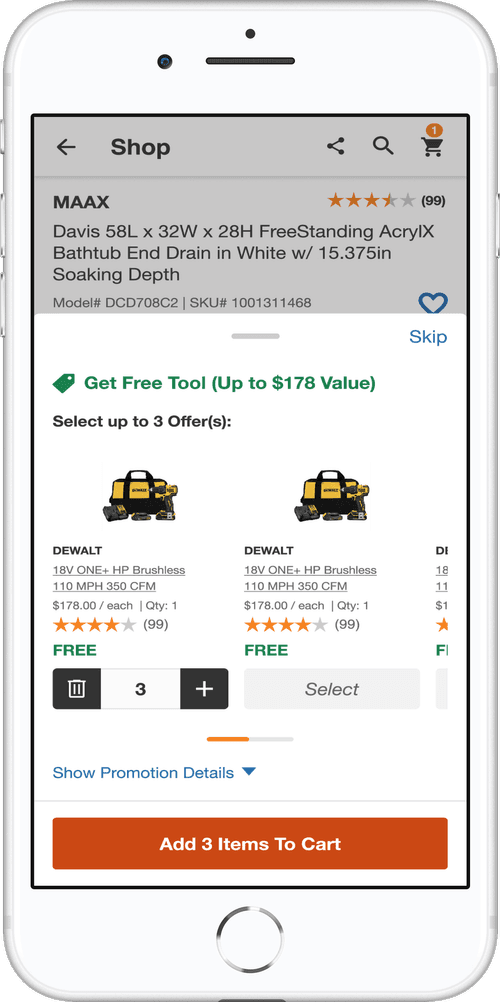
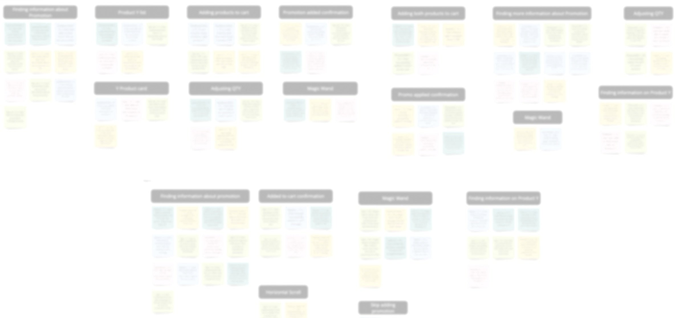
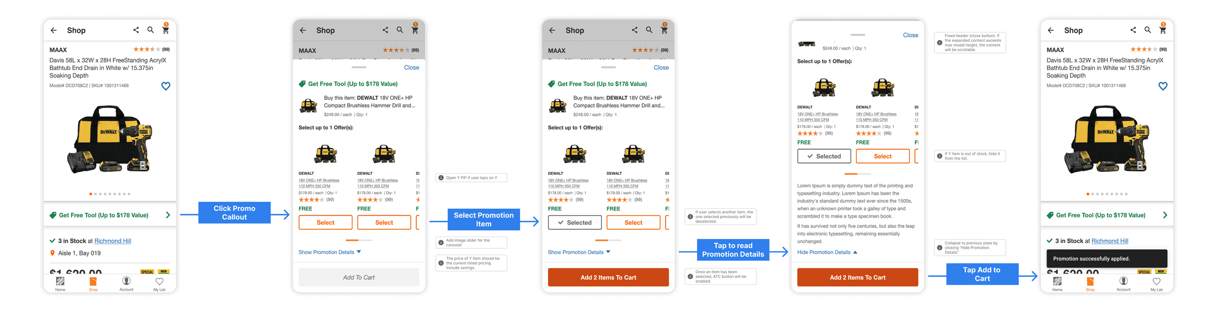
Promotion Path to Purchase
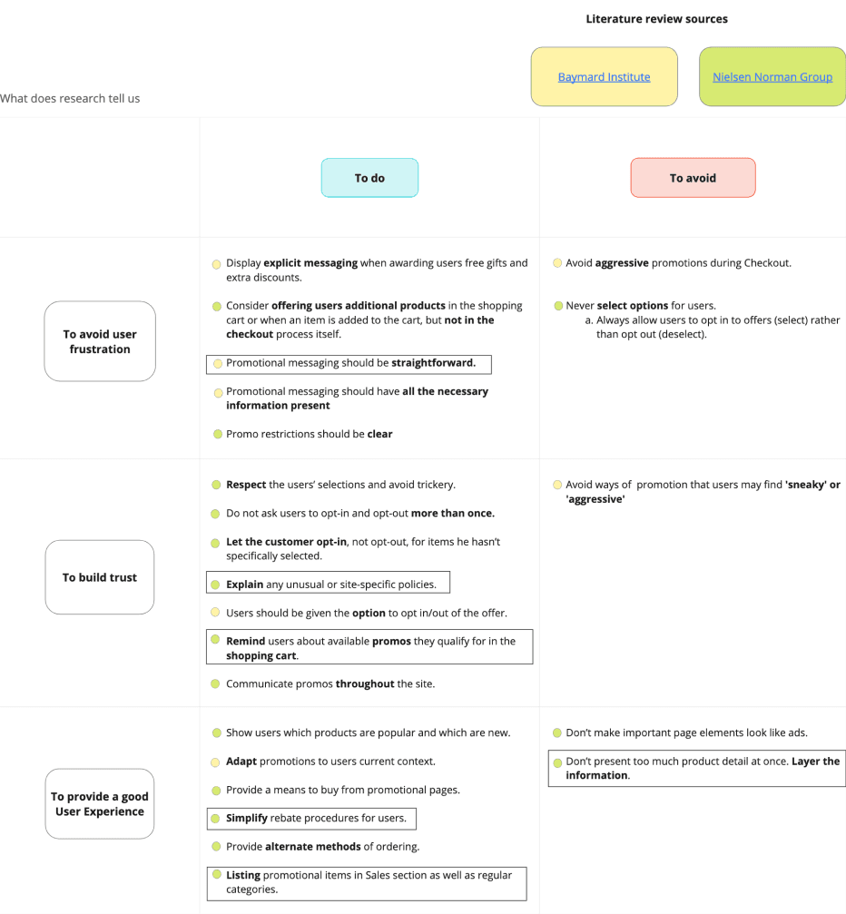
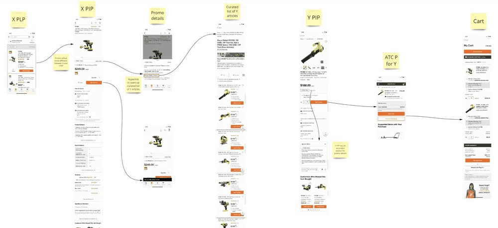
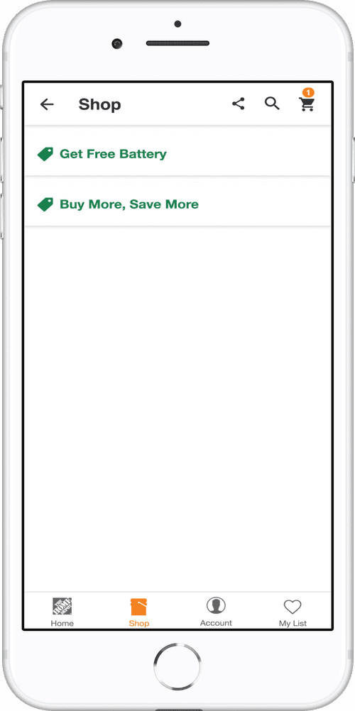
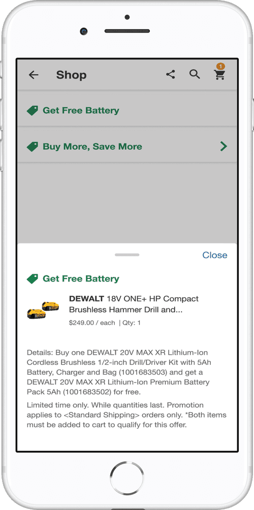
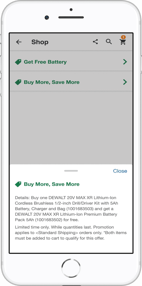
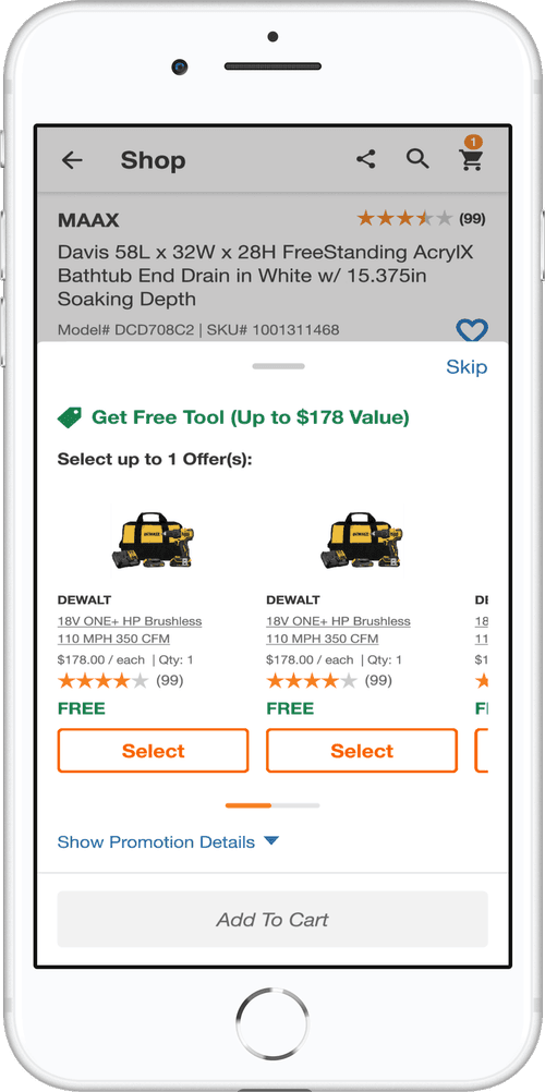
This case study outlines the enhancement of the promotion experience on the Home Depot App during a contract with Home Depot Canada. The project addressed the challenge of a non-intuitive promotion process during checkout, focusing on streamlining the user journey from the first interaction to the seamless addition of products.